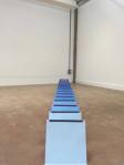
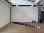
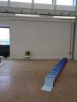
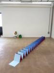
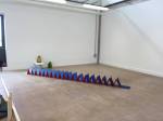
I decided on the title of ‘CC 5.5’ as i have changed the books positioning 5 time as well as the shelf’s positions 5 times for that one book formation. CC stands for Concertina Composition. I think that the titles fits in with the work, it describes the work but is also slightly abstract, i’m hoping that if i ever get to exhibit this again that the title numbering will change with how this piece is shown.
ARTIST STATEMENT
Colour to continue had to occur in space.
– Donald Judd
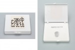
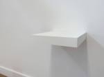
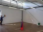
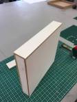
Within my practice, i aim to challenge the conventional assumptions around printmaking and display. I do this through the use of 3D constructs. I am interested in engaging the viewer in a different way to question the relationships between space, colour, form and materials. By using the artist book as a basis i have created an abstract sculpture that interacts with the space and influences how the viewer engages and understands that space. The use of contrasting colours enhances the shape and form of the concertina, questioning the relationship between object and print. A case has been made specifically to house this book form and it acts as an additional, changeable sculpture which echos it’s counterpart. A shelf has also been made for this sculpture, acting as a plinth it creates a contradiction between something that is historically tactile into something that isnt supposed to be touched.